BabelStone Blog
Thursday, 23 February 2006
Stacking Diacritics and Complex Tibetan Stacks
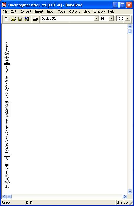
Michael Kaplan thinks that stacking diacritics up to the ceiling and down to the basement is really cool. I think so too, and was disappointed to find that it doesn't work with the current release of BabelPad. Well, with a couple of tweaks (allowing large line spacing values and centring the output vertically within the space between the previous and next lines), I've got stacking diacritics to display correctly in BabelPad, as you can see from the following screenshots of the letter a with 72 combining diacritics (33 above and 39 below). In both cases the font is Doulos SIL at 24 points, but the first screenshot shows what you get if you turn off Uniscribe and render everything as spacing characters, whilst the second one shows monumental stacking when you turn on Uniscribe (version 1.420.2600.2180 on my computer) and set BabelPad's line spacing to 12.0.
Screenshot 1 : Combining diacritics laid out horizontally (Uniscribe off)

Screenshot 2 : Combining diacritics stacked vertically above and below (Uniscribe on)

Unfortunately the new improved version of BabelPad used for these screenshots won't be coming out until May. It was scheduled for release at the end of March, as soon as Unicode 5.0 is released, but we now hear that the release of Unicode 5.0 is being delayed until May. As my working versions of BabelPad and BabelMap have already been upgraded internally to support 5.0 I can't release them until after 5.0 is out. On the one hand, this is rather annoying, as there are lots of bug fixes and improvements that I want to release as soon as possible; on the other hand, it gives me some desperately needed time to get everything else ready for 5.0, including my suite of Phags-pa fonts.
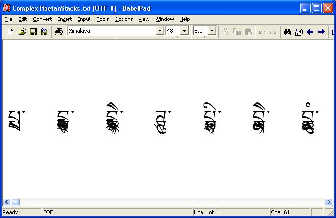
Anyhow, back to stacking diacritics. a with 72 dicaritics is certainly impressive, but not very useful in the real world. However, there is one script that I can think of that does occasionally require multiple stacking characters. This is Tibetan. Tibetan is normally written horizontally with consonant clusters stacking vertically (implemented as one full-sized consonant from the range 0F40..0F69 and zero or many subjoined consonants from the range 0F90..0FB9). Ordinary Tibetan text only has limited vertical stacking (usually just one subjoined consonant, but sometimes two), and can be rendered correctly using Uniscribe version 1.453.3665.0 or later and a competent OpenType Tibetan font (of which there are now several freely available). However, occasionally, in esoteric texts, consonants are piled up (or rather down) like some crazy Yertle stack. With the first version of Uniscribe to support Tibetan OpenType features, Tibetan stacks with many subjoined consonants do not render correctly with any Tibetan OpenType font (I'm using Microsoft's not-yet-released Ximalaya font for these examples).
Screenshot 3 : Complex non-standard Tibetan stacks (Uniscribe version 1.453.3665.0)

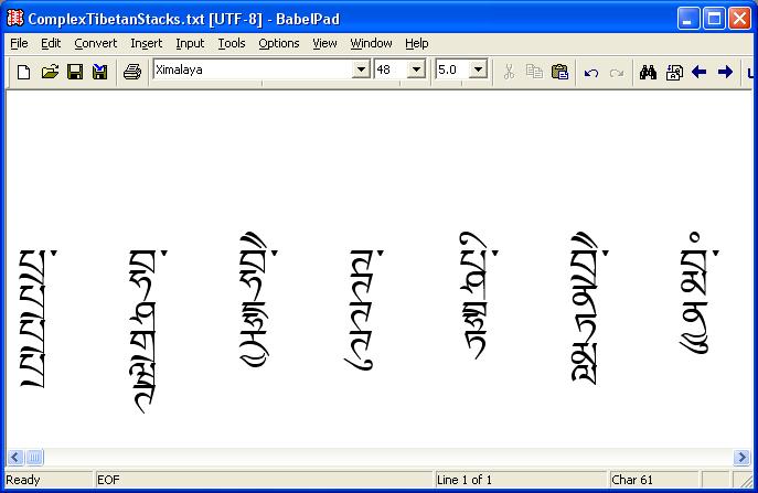
But with the latest versions of Uniscribe (version 1.468.4011.0 or later), in conjunction with the Ximalaya font, it is possible to correctly render Tibetan stacks with many subjoined consonants. It's not terribly pretty, but I think it is pretty amazing.
Screenshot 4 : Complex non-standard Tibetan stacks (Uniscribe version 1.468.4011.0)

The above are all real examples of complex stacking, taken from sngags kyi klog thabs shes rab mig 'byed སྔགས་ཀྱི་ཀློག་ཐབས་ཤེས་རབ་མིག་འབྱེད. However, there are still some complex stacks that cannot yet be rendered in plain text. For example, in some of the complex stacks in this text there is also a horizontal element, where one or more of the subjoined letters is followed horizontally by the letter NGA to make a subjoined syllable such as yang ཡང (the YA is vertically in line with the stack, but the NGA protrudes forward). At present there is no way of indicating horizontal progression at the subjoined level (and there probably never will be).
Also, with the "Ximalya" font (or at least my version of it, maybe the version shipping with Vista [called Microsoft Himilaya] will have been improved) non-standard multiple vowel signs do not work well, for example two i vowel signs will overlay each other, when they should each occupy their own space. As double i vowel signs are found in some abbreviations (which do not use abnormal stacking), the failure to render multiple vowel signs correctly is a little disappointing.
Index of BabelStone Blog Posts