BabelStone Blog
Sunday, 9 July 2006
The Long and the Short of the Letter S
Commenting on the Rules of Long S, Conrad Roth said :
I have definitely seen Renaissance English texts (though I can't remember which particular examples) where in a double s the first is long and the second short. I was under the impression that this was the origin of the German Eszett, which looks like a long-s followed by a short-s, though maybe I'm wrong about this.
To which Uncle Jazzbeau responded :
The German eszett is a long-s followed by a z.
Wikipedia does provide quite a good overview of German eszett ß, although I personally find it all a little bit confusing. As my previous post on long-s left much unsaid about the origins of the long-s, which should perhaps have preceded any discussion of its rules of usage, I shall endeavour to give a brief, illustrated history of the letter "s", culminating with my take on the eszett issue. Western paleography isn't my area of expertise (although I do profess a certain dilettantish interest), so I expect my more learned readers to correct me where I may have inadvertently strayed from the truth.
The Origins of the Long S
The long-s originated at a very early date in cursive Roman scripts, and can be seen in both Old Roman Cursive (1st to 3rd centuries AD) and New Roman Cursive (late 3rd century to 7th century). The form used in Old Roman Cursive is written in two strokes, a vertical downstroke followed by a horizontal or diagonal cross-stroke (see Vindolanda I Fig.11). The following example from one of the famous Vindolanda tablets clearly illustrates this early form of the Roman cursive letter s :
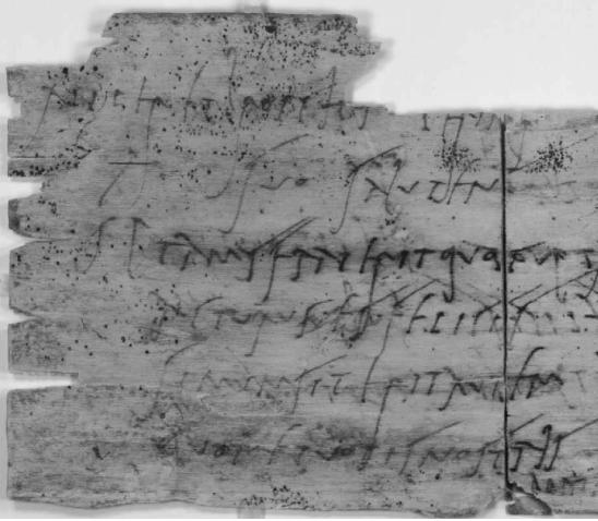
"suo" (line 2), "salutem" (line 2), "simum" (line 5), "sit" (line 5), etc.
In New Roman Cursive the way the letter was written changed so that the letter starts with a vertical downstroke but is followed by a curving upstroke (see Vindolanda I Fig.10), resulting in a letter that looks similar to our modern letter "r". Most of the early medieval scripts that devloped from the Roman cursive tradition, such as Merovingian (developed in France during the 7th century), Visigothic (developed in Spain during the late 7th century), Beneventan (developed in southern Italy during the 8th century) and Carolingian (developed at the court of Charlemagne at the end of the 8th century), inherited this form of the letter s.
In Roman uncial and half-uncial scripts the letter s often followed the form of the Roman capital S, and so early Latin texts written in insular half-uncials such as the Lindisfarne Gospels (circa 700) and the Book of Kells (circa 800) mostly use short-s (although long-s is sometimes used, for example in the "st" ligature). However, as the insular script developed, a distinctive long-s form, that must ultimately be derived from Roman cursive, came to be employed. Shown below are two manuscripts in which the insular form of the long-s is very clear, the first an Old English manuscript dating to about the year 1000, and the second an Old Irish manuscript which was written between the 11th and 15th centuries (the insular script died out in England after the Norman Conquest, but the insular tradition was preserved in Ireland where it evolved into the Gaelic script used for writing Irish up to modern times) :
The Cædmon Manuscript [part of the Old English verse rendition of Genesis] (Bodleian Junius MS 11 folio 14)
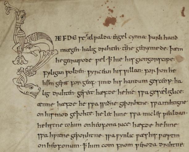
"se" (line 1), "his" (line 3), "giongorscipe" (line 3), "gesceop" (line 5), "swa" (lines 6-10), etc.
The Annals of Inisfallen [part of the entry for 1192] (Bodleian MS. Rawl. B. 503 folio 40r)
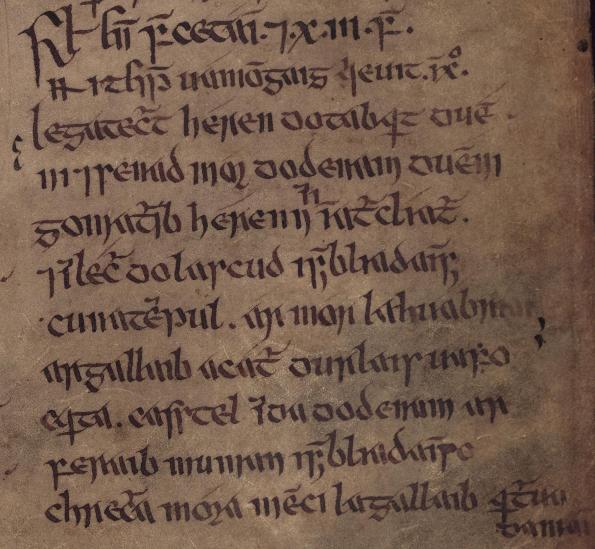
"senad" (line 4), "lascud" (line 6), "durlais" (line 8), "casstel" (line 9).
In the influential Carolingian script the hook of the first stroke is far less pronounced than the insular letter s, forming a residual knob at the top of the vertical section of the letter, which is the precursor of the left cross-stroke on the 18th century long-s. This Carolingian long-s is beautifully illustrated in the late 10th century English manuscript shown below, which was described by Edward Johnston as "an almost perfect model for a model formal hand" :
Psalter (British Library Harl. MS 2904)
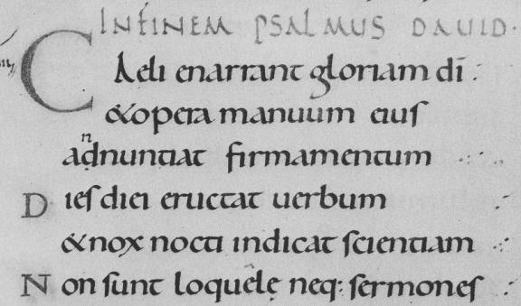
Alfred Fairbank, A Book of Scripts (Penguin Books, 1949) Plate 8
"eiuſ" (line 2), "ſcientiam" (line 5), "ſermoneſ (line 6).
Positional Differentiation of Long S and Short S
In all the examples given above long-s is used exclusively, and I have not been able to find any examples showing a consistent positional distinction between long-s and short-s prior to the 12th century, although my guess is that a positional distinction between the two forms of the letter "s" first arose sometime during the 11th century.
A positional distinction, with short-s used finally and long-s used initially and medially, can be seen in this early 12th century Italian manuscript written in a Carolingian script :
Homilies and Lessons (British Library Harl. MS 7183)
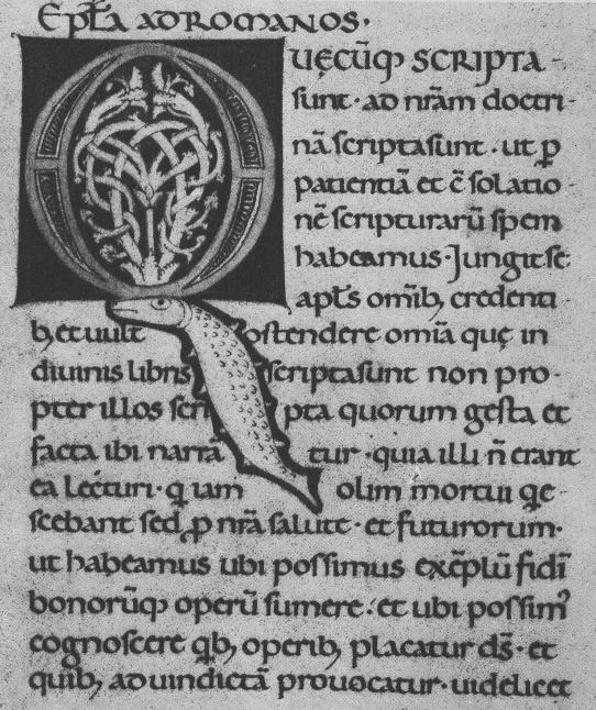
Alfred Fairbank, A Book of Scripts (Penguin Books, 1949) Plate 9
"poſſimus" (line 14), etc.
During the high medieval period (13th-15th centuries) the angular Gothic script became ubiquitous, pushing the Carolingian script out of common use. As far as I can tell, almost all of the manuscripts from this period that are written in a Gothic script differentiate the long-s and short-s by position; see for example the beautiful Luttrell Psalter (circa 1325-1335). However, as I am more interested in vernacular fiction than liturgical texts, I will give as my example a section from Sir Gawain and the Green Knight :
Sir Gawain and the Green Knight (British Library Cotton MS Nero A X folio 101a).
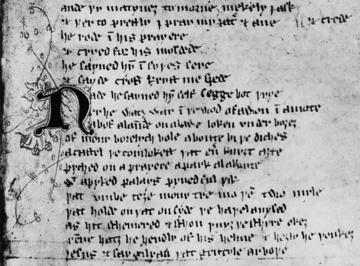
"ſayned" (line 7), "ſelf" (line 7), "ſegge" (line 7), "diches" (line 10), "caſtel" (line 11), "palays (line 13), "Ieſus" (line 18) etc.
Eventually, during the Renaissance, the simpler and cleaner Carolingian script was revived under the name littera antiqua. The example below is from a manuscript written by Ciriagio at Florence in 1454. Note how in this manuscript long-s is used exclusively in all positions, imitating original Carolingian practice; but by the end of the 15th century the rule of using short-s finally and long-s only initially and medially had become firmly established.
De Dignitate et Excellentia Hominis (British Library Harl. MS 2593)
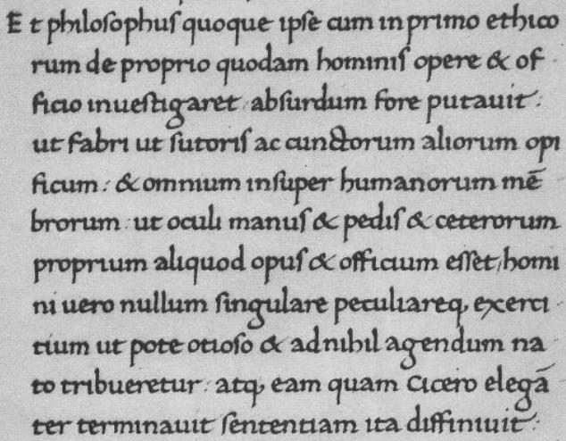
Alfred Fairbank, A Book of Scripts (Penguin Books, 1949) Plate 13
"philoſophuſ" (line 1), etc.
As an aside, Omniglot gives an image of the prologue from Beowulf written in an Anglo-Saxon insular script in the page devoted to the Old English script, but it has obviously been reconstructed from the modern transcription, without any reference to the original manuscript, as it uses long-s initially and medially but short-s finally, when in fact the Beowulf manuscript normally uses the long-s in all positions (interestingly the long-s is Carolingian rather than Insular in the manuscript) :
Beowulf [lines 1-11] (British Library Cotton MS Vitelius A XV folio 132)
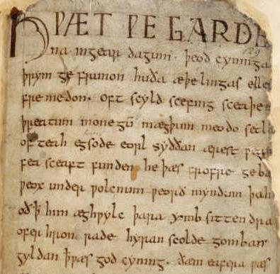
"æþelingaſ" (line 3), "ſcyld" (line 4), "wæſ" (line 11); but note the anomalous "syððan" (line 6).
The Double S Ligature
During the 15th century cursive forms of the revived Carolingian style script (Antiqua) started to develop in Italy, including the Chancery hand that was approved for use in the Vatican by Pope Eugenius IV (1431-1447). The distinction between roman and italic hands is apparent in this 16th century Italian manuscript. What is interesting to us is that in the roman script double-s is written using a ligature of long-s and long-s, as is the case with 18th century roman typefaces, but in the italic script double-s (whether medial or final) is written using a ligature of long-s and short-s, which is very similar in form to the German sharp s ß.
La Paraphrasi (British Library Harl. MS 3541)
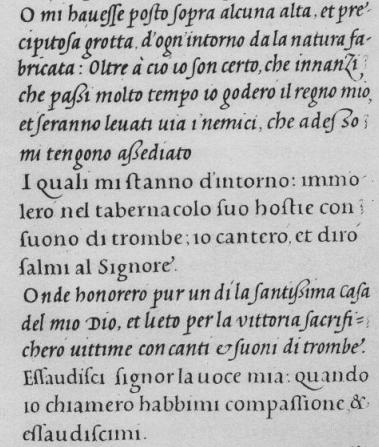
Alfred Fairbank, A Book of Scripts (Penguin Books, 1949) Plate 17
"paßi" (line 4), "adeßo" (line 5), "aßediato" (line 6), "santißima" (line 11); "eſſaudiſci" (line 14), "compaſſione" (line 15).
And in this beautiful handrwiting from an influential book of scripts published by G.B. Palatino in 1544 you can see some more examples of the double s ligature.
Libro nel qual s'insegna a scrivere (Rome, 1544)
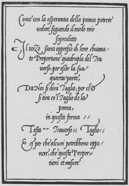
Alfred Fairbank, A Book of Scripts (Penguin Books, 1949) Plate 20
"appreßo" (line 4), "eßer" (line 6).
Books such as Palatino's helped spread the use of italic scripts to the rest of Europe, which is why, as Conrad pointed out, you may well see a long-s short-s ligature (ß) in English texts from the 15th and 16th centuries. I was hoping to use as my example something from the hand of Queen Elizabeth (who had a beautiful hand as a princess) but was unable to find anything suitable, so instead I have chosen a printed text, Queen Elizabeth's Letters Patent for the 1560 Book of Common Prayer in Latin (Liber Precum Publicarum) :
Liber Precum Publicarum [Queen Elizabeth's Letters Patent] (1560)
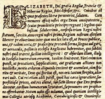
"aßensum" (line 7), "paßim" (line 10), but "eſſe" (line 19).
German Eszett Ligature
Whilst Antiqua typefaces had come to dominate the printing trade in most of Europe by the early 17th century, blackletter typefaces, derived from the Medieval Gothic script, continued as the normal typeface for printed books in Germany until the 20th century.
What may perhaps be surprising to those unfamiliar with German set in blackletter typefaces is that where German words in modern type are written with an eszett or sharp s (ß), in blackletter typefaces a ligature of the letters long-s and z is employed. My first example comes from Johann Schönsperger's 1490 German Bible, which is set in the Schwabacher typeface favoured during the late 15th and early 16th centuries. Here the "ſz" ligature looks quite similar to the "ſs" ligature, as the top of the 3-shaped letter "z" ligates with the top of the long-s.
Schönsperger-Bibel (Augsburg: Johann Schönsperger, 1490) page b3b

"heiſz" (line 1), "hauſz-fraw" (line 4), "auſz" (lines 7 and 12), "laſze" (line 9), "lieſz" (line 12), "paradeÿſz" (line 13).
My second example, dating from the early 19th century, is set in a traditional Fraktur typeface. In the Fraktur typeface the letter "z" does not join to the top of the long-s, so that the ligature is much more clearly an "ſz" ligature, not an "ſs" ligature.
Der Hufstand der Braunschweiger (Braunschweig: Friedrich Bieweg und Sohn, 1830) p.38
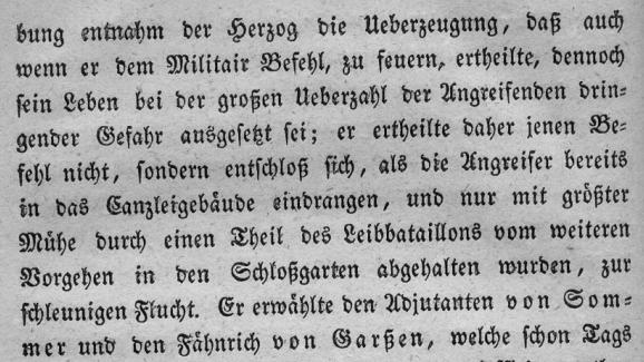
"daſz" (line 1), "groſzen" (line 3), "entſchloſz" (line 5), "gröſzter" (line 6), "Schloſzgarten" (line 8), "Garſzen" (line10).
My final example is from an early 20th century book, set in what I would describe as a very modern and readable rounded semi-Fraktur typeface.
Hermann Hesse, Aus Indien (Berlin: S. Fischer, 1913) p.11
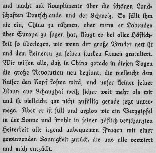
"groſze" (lines 5 and 8), "daſz" (line 7), "weiſz" (line 10).
When German books were printed in Antiqua typefaces, as they occasionally were from the 17th century onwards, the "ſz" ligature was replaced by the "sharp s" ß. What I'm not entirely certain about is whether the ß in such books was graphically an "ſz" ligature modelled after the Schwabacher form of the "ſz" ligature, or whether it was a borrowing of the "ſs" ligature from the Italic tradition. Unfortunately I haven't got access to any early non-blackletter German books, which may have helped shed some light on the matter. Anyhow, whether the ß was originally conceived of as an "ſz" ligature or an "ſs" ligature, it later became identified as an "ſs" ligature, which is why ß normally uppercases to "SS" rather than "SZ" as might have been expected.
Addendum [2006-07-17]
I have been browsing through some of the many Italian books published during the 16th and 17th centuries that are available on-line from the British Library at Renaissance Festival Books, and I was surprised at how relatively uncommon the ligatured long-s short-s (ß) is in these works. It is found in some books, but only in text printed in italic typeface (e.g. grandißima, meßa, etc. [1539], dignißimi [1549], reuerendiß [1574], deuotißimo [1579], appreßo [1587], neceßaria [1600], Serenißimo [1613]), and in most cases alongside words spelled with double long-s or unligatured long-s short-s or even short-s long-s; there does not appear to be any clear rule as to when ligatured long-s short-s is used in preference to double long-s.
On the other hand, many of the books, especially from the middle of the 16th century onwards, do use a common rule for double s in text set in roman typeface; namely unligatured long-s short-s at the end of a word and in the middle of a word before a letter 'i', but double long-s in the middle of a word before any other vowel. This rule is illustrated in the example below.
Descrizione della entrata delle serenissima regina Giovanna d'Austria ... (Florence, 1566) p.6
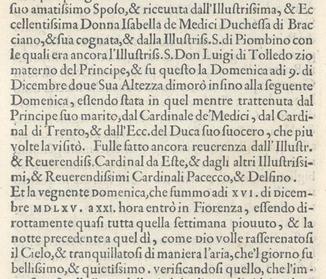
"amatiſsimo" (line 1), "Ducheſſa (line 2), "Illustriſs." (line 3), etc.
Index of BabelStone Blog Posts